Now that you've added several programming statements to your Visual Basic language repertoire, you can learn about additional controls to add new features to your applications and to take advantage of some of the more powerful commands you now know. As you learn about new controls, your programming ability grows by leaps and bounds because your programs become richer in functionality and user interaction.
You'll learn about the selection controls, how to program scrollbars, and how to set the Timer control to let your application know when a predetermined amount of time has passed.
The highlights of this hour include
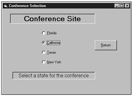
Figure 11.1 shows an application with four option buttons. An option button gives
your user a choice. By clicking the option button or by sending the focus to the
option button and pressing the Spacebar to choose the option, the user selects or
deselects an option button. The option button has a black center inside its option
button circle when selected.
Figure
11.1. A form with four option buttons.
Option buttons act in a mutually exclusive fashion. Only one option button can be selected at any one time. Therefore, in Figure 11.1, the user could not select two or more of the options. If the user were to click Texas, the California option would no longer be selected. You don't have to do anything special to ensure that only one option button is selected at any one time; Visual Basic takes care of removing the former option's selection when the user selects a subsequent option button.
NOTE: Option buttons are sometimes called radio buttons. Many car radios used to have five or six buttons that selected preset stations. The listener could only select one station; as soon as the listener pushed a button, the previous station's button popped out.
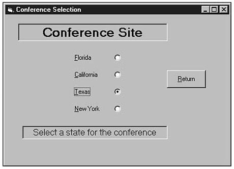
The option button supports several of the properties you're already familiar with,
such as the Appearance and Alignment properties. The Alignment
property determines whether the option button text resides to the left or right of
the option button. Figure 11.2 shows the option buttons with their Alignment
property set to 2-Right Justify. The alignment you set depends on where
the option buttons are to fall in relation to other controls.
Figure
11.2. These option buttons have a right-justified
Alignment property.
TIP: An option button control array makes setting option button properties, such as the Alignment property, simple. Several option buttons almost always appear together and the control array lets you set only one's property and the others will receive the same property settings. If you do not create an option button control array, you can change all the option button properties at once, even without a control array, by first selecting all the option button controls and then setting the properties for all of them at once.
The Value property is perhaps the most important option button property because the Value property changes at runtime and determines whether the option button is currently selected. By the way, the user can select only one option button at a time, but the application may start up without any option buttons being set if you don't set any in the Properties window or in code.
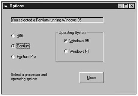
Figure 11.3 shows an application called Controls that comes in the VB Samples folder. (Load the Controls.VBP project and run the application to select the Option Buttons command button and display Figure 11.3's window.) This option button application lets you select a computer type and operating system. Figure 11.3 seems to violate the option button's primary rule: More than one option button is selected at the same time (the Pentium option button and the Windows 95 option).
Sometimes a form will need several sets of option buttons, just like the form
in Figure 11.3. In each set the user should be allowed to select only one option
button, but one option button should be set from each set at the same time. Therefore,
you must revise the previous rule, which states that only one option button can be
set at one time. The truth is that only one option button inside a frame can be set
at one time.
Figure
11.3. Two option buttons are set.
New Term: A frame is a rectangular region on a form that holds other controls and groups the controls into a single set.
A frame is a control that holds other controls. The frame is a rectangular outline with an optional title. When you want to place multiple sets of option buttons on a form, first place the frame or frames onto the form. (You can place any control on a frame, but the frame especially helps group option buttons so you can offer multiple option button sets.)
NOTE: The form acts as a default frame. Therefore, two sets of option buttons reside on Figure 11.3's form: One set resides in a frame and the other set resides on the form itself so you consider them framed as well, even though no specific frame control surrounds them.
The frame control does support properties that determine the frame's look and caption and a frame does support a few events, but most programmers use the frame as a holding place to group other controls. Once you place controls in a frame, you can move the frame and all the frame's controls move with it. Therefore, adjusting framed controls is relatively easy to do.
WARNING: Always place a frame on the form before putting controls in the frame. If you simply move controls from elsewhere on the form to the frame, the controls will not be in the frame but will exist simply on top of the frame. Visual Basic will not consider them framed together. To add additional controls to a frame with controls, click one of the framed controls before adding the new control.
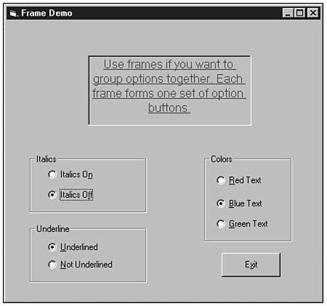
Figure 11.4 shows an application that contains three frames that determine how
text appears inside a label. The user can select only one option button inside each
frame. As soon as the user changes one of the options, the option button's Click()
event responds to the change and sets the Label property accordingly. Listing
11.1 contains the complete form module code that takes care of the user's action.
The label is initialized in the Form_Load() event procedure (the procedure
that executes right before the user sees the form) and the remaining event procedures
are the responses to various user clicks on the form's controls. The controls are
named well enough so that you will know where the controls appear in Figure 11.4.
Figure
11.4. A form with three frames.
Private Sub Form_Load()

  ` Initialize the label's text

  Dim strLabel1 As String

  Dim strLabel2 As String

  Dim strLabel3 As String

  Dim strLabel4 As String


  strLabel1 = "Use frames if you want "

  strLabel2 = "to group options together. "

  strLabel3 = "Each frame forms one set "

  strLabel4 = "of option buttons."


  lblFrames.Caption = strLabel1 & strLabel2 & _

                      strLabel3 & strLabel4


  ` Set the label's properties

  lblFrames.FontItalic = True

  optItalicTrue.Value = True


  lblFrames.FontUnderline = True

  optUnderTrue.Value = True


  lblFrames.ForeColor = vbBlue

  optBlue.Value = True

End Sub


Private Sub optItalicTrue_Click()

  lblFrames.FontUnderline = True

End Sub


Private Sub optItalicFalse_Click()

  lblFrames.FontUnderline = False

End Sub


Private Sub optRed_Click()

  lblFrames.ForeColor = vbRed

End Sub


Private Sub optBlue_Click()

  lblFrames.ForeColor = vbBlue

End Sub


Private Sub optGreen_Click()

  lblFrames.ForeColor = vbGreen

End Sub


Private Sub optUnderTrue_Click()

  lblFrames.FontItalic = True

End Sub


Private Sub optUnderFalse_Click()

  lblFrames.FontItalic = False

End Sub


Private Sub cmdExit_Click()

   Unload Me

   End

End Sub
Listing 11.1 demonstrates the use of named literals. The background colors assigned to the label are named literals that come with Visual Basic. Table 11.1 lists the named literal colors that you can use and assign to any property that uses color values such as the background and foreground colors of several controls. Given that Windows supports millions of possible colors, the eight colors that Table 11.1 lists represent a small number of colors you can possibly set. (Named literals do not exist for other color values.) Visual Basic supplies several ways to specify colors so that you can set a color from among the millions possible. For most situations, however, and for simplicity, Table 11.1's named literals work for most applications.
Table 11.1. The color named literals.
| Literal | Color |
| vbBlack | Black |
| vbRed | Red |
| vbGreen | Green |
| vbYellow | Yellow |
| vbBlue | Blue |
| vbMagenta | Magenta |
| vbCyan | Cyan |
| vbWhite | White |
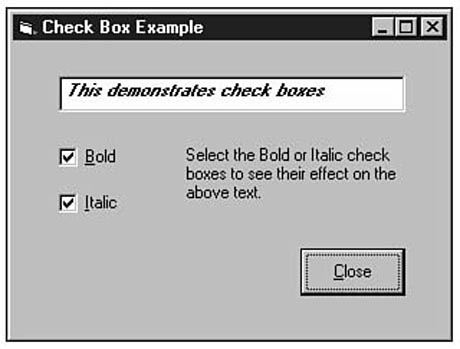
Figure 11.5 shows a form with check boxes. The Check Box control works just like
the option button, with two differences: A selected check box shows the selection
with a checkmark, and check boxes are never mutually exclusive. Therefore, the user
can select one or more check boxes even if those check boxes reside in the same frame
or on the same form.
Figure
11.5. A form with two check boxes.
NOTE: Figure 11.5's application is from the Controls.VBP project included in VB's Samples folder.
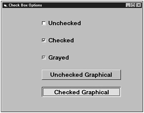
The Check Box control supports the same fundamental properties as the option button except that the Value property determines not only if the box is checked (if 1) or unchecked (if 0), but a check box can also be grayed (if the Value property contains 2). Users sometimes use a grayed check box to determine whether part of a selected option is true. In addition, the programmer may gray out a box to show that the selection is unavailable under the current conditions.
Visual Basic version 5 added a new Style value to the Check Box control's property list. The available Style property values are 0-Standard and 1-Graphical. The graphical style value makes the check box look a lot like a command button that stays pressed (when selected) or unpressed (when not selected).
Figure 11.6 shows a form that illustrates the various check box property options
available to you.
Figure
11.6. Some Check Box control property
options.
Scrollbars let users control value changes. Rather than type specific values, the user can move the scrollbars with the mouse to specify relative positions within a range of values. The toolbox includes both a Horizontal Scrollbar and a Vertical Scrollbar control.
Table 11.2 contains a list of important scrollbar properties that determine the behavior of the scrollbar.
Table 11.2. Fundamental scrollbar properties.
| Property | Description |
| LargeChange | Specifies the amount that the scrollbar changes when the user clicks within the scrollbar's shaft area. |
| Max | Indicates the maximum number of units that the scrollbar value represents at its highest setting. The range is from 1 to 32767 (the default Max value). |
| Min | Indicates the minimum number of units the scrollbar value represents at its lowest setting. The range is from 1 (the default Min value) to 32767. |
| SmallChange | Specifies the amount that the scrollbar changes when the user clicks an arrow at either end of the scrollbar. |
| Value | Contains the unit of measurement currently represented by the position of the scrollbar. |
When you place a scrollbar on a form, you must decide at that time what range of values the scrollbar is to represent. The scrollbar's full range can extend from 1 to 32767. Set the Min property to the lowest value you want represented by the scrollbar. Set the Max property to the highest value you want represented by the scrollbar.
When the user eventually uses the scrollbar, the scrollbar arrows control small movements in the scrollbar's value determined by the SmallChange property. Clicking the empty part of the shaft on either side of the scrollbox produces a positive or negative change in the value represented by the LargeChange property. The user can drag the scrollbox itself to any position within the scrollbar shaft to jump to a specific location instead of changing the value gradually.
Suppose, for example, that a horizontal scrollbar represented a range of whole dollar amounts from $5 to $100. When the user clicks the scroll arrows, the scrollbar's value changes by $1. When the user clicks the empty shaft on either side of the scrollbox, the scrollbar's value changes by $5. Here are the property values that you would set that determine how VB interprets each click of the scrollbar: Min: 5, Max: 100, SmallChange: 1, and LargeChange: 5.
The physical size of the scrollbar has no bearing on the scrollbar's returned values when the user selects from the scrollbar. Adjust the scrollbars on your form so that the scrollbars are wide enough or tall enough to be appropriately sized for the items that they represent.
New Term: A thumb is the scrollbar's moving scrollbox (the elevator-like box).
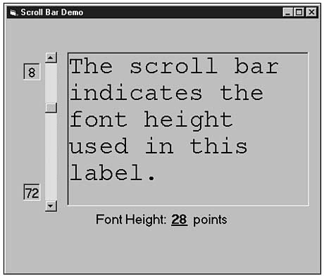
Figure 11.7 shows an application that uses a vertical scrollbar to change the
size of a label's font size. As the user clicks the top scrollbar arrow, the font
size shrinks by the SmallChange value. As the user clicks the bottom scrollbar
arrow, the font size increases by the SmallChange value. (The application's
SmallChange property value is 1.) If the user clicks in the scrollbar's
shaft on either side of the scrollbar's thumb, the LargeChange property
value of 5 is either added to or subtracted from the font size.
Figure
11.7. The vertical scrollbar determines
the label's font size.
Listing 11.2 shows the code behind Figure 11.7. The code is not lengthy because the
scrollbar's Click() event procedure must change only the label's text font
size and the label that displays the current font size. Any time the user changes
the scrollbar, the scrollbar's Click() event procedure executes.
Private Sub vsbHeight_Change()

  lblScroll.FontSize = vsbHeight.Value

  lblFontHeight.Caption = vsbHeight.Value

End Sub
The Timer control acts unlike any other control you've seen so far. The Timer control always works in the background and the user never sees the timer on the form. You will see the Timer control during design time because you need to be able to select the control and change its properties. Nevertheless, the timer's purpose is to work in the background, triggering an event every once in a while according to the clock ticks.
Your computer has an internal clock to keep things running smoothly. The hardware requires an accurate clock for memory refreshes and CPU cycle coordination efforts. Software, such as Visual Basic, can tap into the internal clock and utilize its timing to control certain time-based events that your application may need to perform.
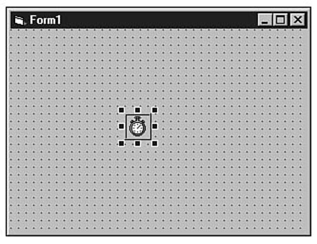
Figure 11.8 shows the Timer control as it appears when you place the control on
a form. The Timer control supports only seven properties because the Timer control
never appears on the form at runtime. Therefore, the control has no need for many
of the style and size properties used for other controls the user sees.
Figure
11.8. The Timer control appears on the
form only at design time.
You can place the timer out of the way of your form's other controls since its physical location is trivial. Once you place the timer on the form, you should set its Interval property because Interval is the most important timer property. The Interval property contains a value that must range from 1 to 65535. The value is in milliseconds (or thousandths of a second), so an Interval value of 500 would equate to half a second. The Timer control generates only one event: the Timer event. The Timer control triggers a Timer event after each interval of time goes by. Therefore, if you named a Timer control tmrClock, and if you set the control's Interval property to 1000, Visual Basic would execute the tmrClock_Timer() event procedure approximately every second.
New Term: A millisecond is one-thousandth of a second.
WARNING: The Timer control is not a perfect timer, just a good timer. Other processes occurring inside your computer can cause the Timer control to be off by a few milliseconds. The smaller the Interval value, the more likely the Timer event will be off. Fortunately, the Timer control works without much of a timing hitch, especially given today's faster computers.
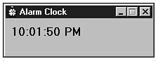
Figure 11.9 shows the Alarm sample application that comes with Visual Basic in
the Samples\PGuide folder. The Timer's Interval property value
is set to 500 and the time of day updates every half-second (the time is
shown in full seconds; the half-second update helps correct timing problems that
might occur every few half-seconds). Therefore, if you run the Alarm application,
a Timer event will occur every one-half second.
Figure
11.9. The Timer control generates an event
every few milliseconds.
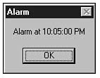
Clicking on the Alarm application's small Form window produces an input box that
asks you for an alarm time. The Timer() click procedure from then on compares
the current time with the time that the user enters and, if the alarm time has been
reached, the alarm goes off. The alarm displays Figure 11.10's dialog box, which
informs the user that the alarm time is reached.
Figure
11.10. The Timer() event procedure
determined that the alarm time was reached.
WARNING: Feel free to study the sample Alarm application's code, but be warned that the application uses a few built-in functions that you will not master until Hour 14, "Built-in Functions Save Time."
If you need an interval that's larger than the 65535 Interval value allows (this maximum Interval value provides only about a 10-second interval), insert some If logic at the top of the Timer() event procedure that checks to see if the required amount of time has passed since the last interval. (To do this, you will need some of the time functions described in Hour 14.)
In this hour you have learned about several new controls so you can begin adding more user interactivity to your applications. The option buttons and check boxes work almost exactly alike except that the option buttons are mutually exclusive and provide your users with single options from a selection. The scrollbars let your users select values based on a range using either a horizontal or vertical scrollbar. Finally, the Timer control keeps track of time passing during your application's execution and triggers a Timer event every time the Interval value of time has passed.
Hour 12, "Dialog Box Basics," builds further on your I/O skills by demonstrating how to create common dialog boxes. Your users will be able to use the dialog boxes to enter and select multiple values.
The quiz questions and exercises are provided for your further understanding. See Appendix C, "Answers," for answers.